Project Universe
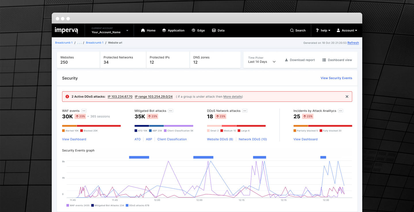
Imperva provides customers with security and analytics data to support their tactical decision making process while investigating security or operational incidents. Customers jobs depends on the visibility and control.
Research
PAIN POINTS
While interviewing customers we evident that it is hard and time consuming to aggregate and correlate data manually.
Furthermore, we evident that it is impossible to identify critical issues and correlate data across the system.
Furthermore, we evident that it is impossible to identify critical issues and correlate data across the system.
problem
1. Overseeing hundreds of sites one by one to find a problem is a real headache
2. Multiple clicks to goal, and lack of data aggregation cause a long resolution time.
3. Summing statistics manually is time consuming and may become impractical without API.
2. Multiple clicks to goal, and lack of data aggregation cause a long resolution time.
3. Summing statistics manually is time consuming and may become impractical without API.
Needs
1. The customer wants a one stop place with all essential information, that can help him to take decisions.
2. The customer needs to evaluate Imperva's ROI over time each quarter.
2. The customer needs to evaluate Imperva's ROI over time each quarter.
ASSUMPTION
A unified dashboard (top level) will help to quickly understand the big picture, and reduce time to resolution.
Design principles
Highlight what’s important
Data can actually mask unexpected anomalies, trends or patterns that do matter. Different visual cues can help the audience to spot key anomalies in the data.
Role-based
Home is designed for our customers business needs, and how they work. Home provides the right information at the right time and reflects the way customers actually work.
Actionable insights, Recommend actions
Without sufficient contextual information, it can be more difficult to know when action is required. Urgency to act is introduced when people see they are underperforming compared to a previous time period, expected target or industry average.
Anticipate the flow of questions
Using an inverted pyramid approach, you begin with high-level KPIs and then lead into breakdowns by relevant dimensions. Rather than encountering frustrating dead ends, a clear content hierarchy and filtering options can guide users to insights that need their attention.
Development
Information ARCHITECTURE
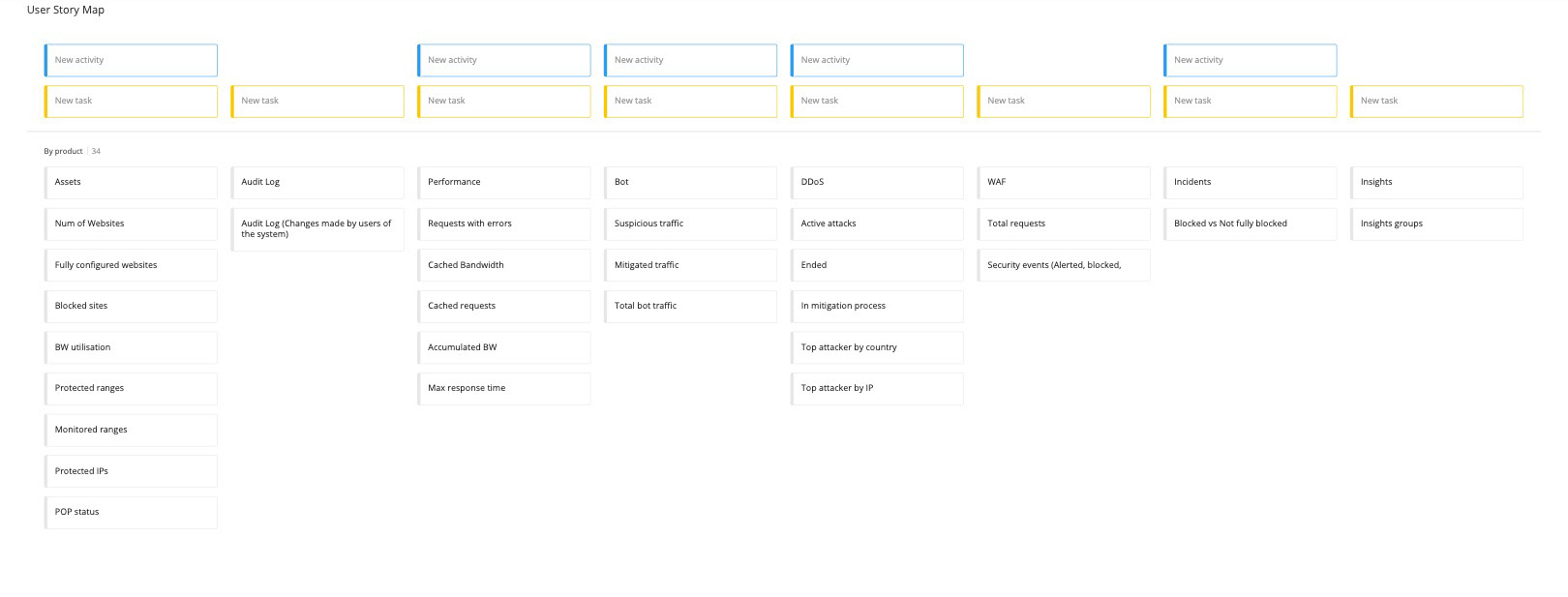
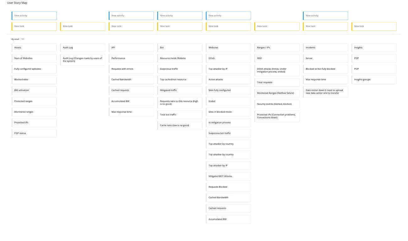
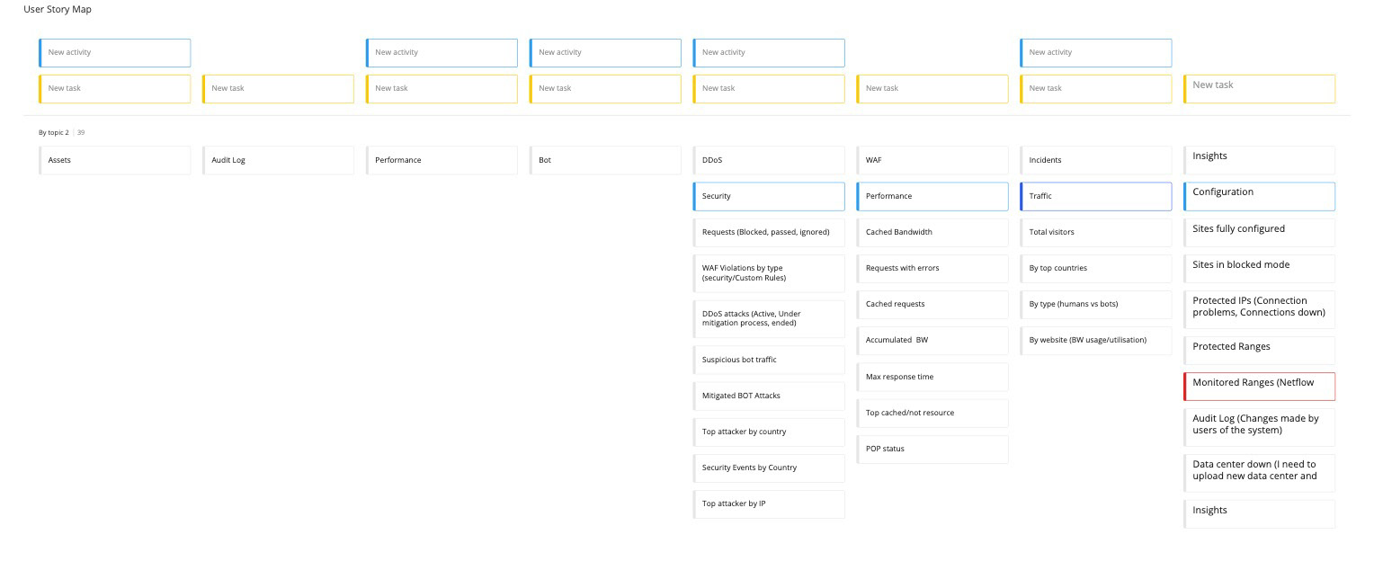
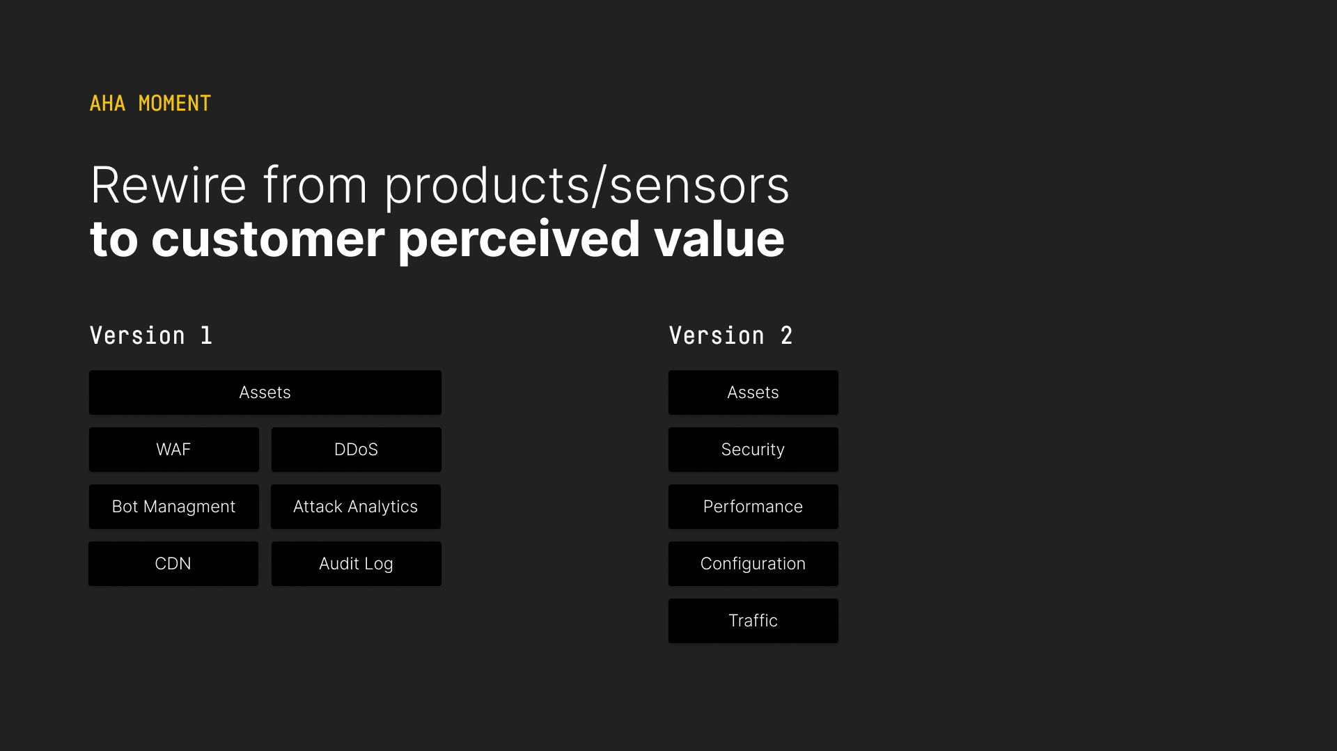
We started an inventory analysis and experimented several architectures based on customer journeys. The current is by product, and we added by assets and by topic.
Wireframes
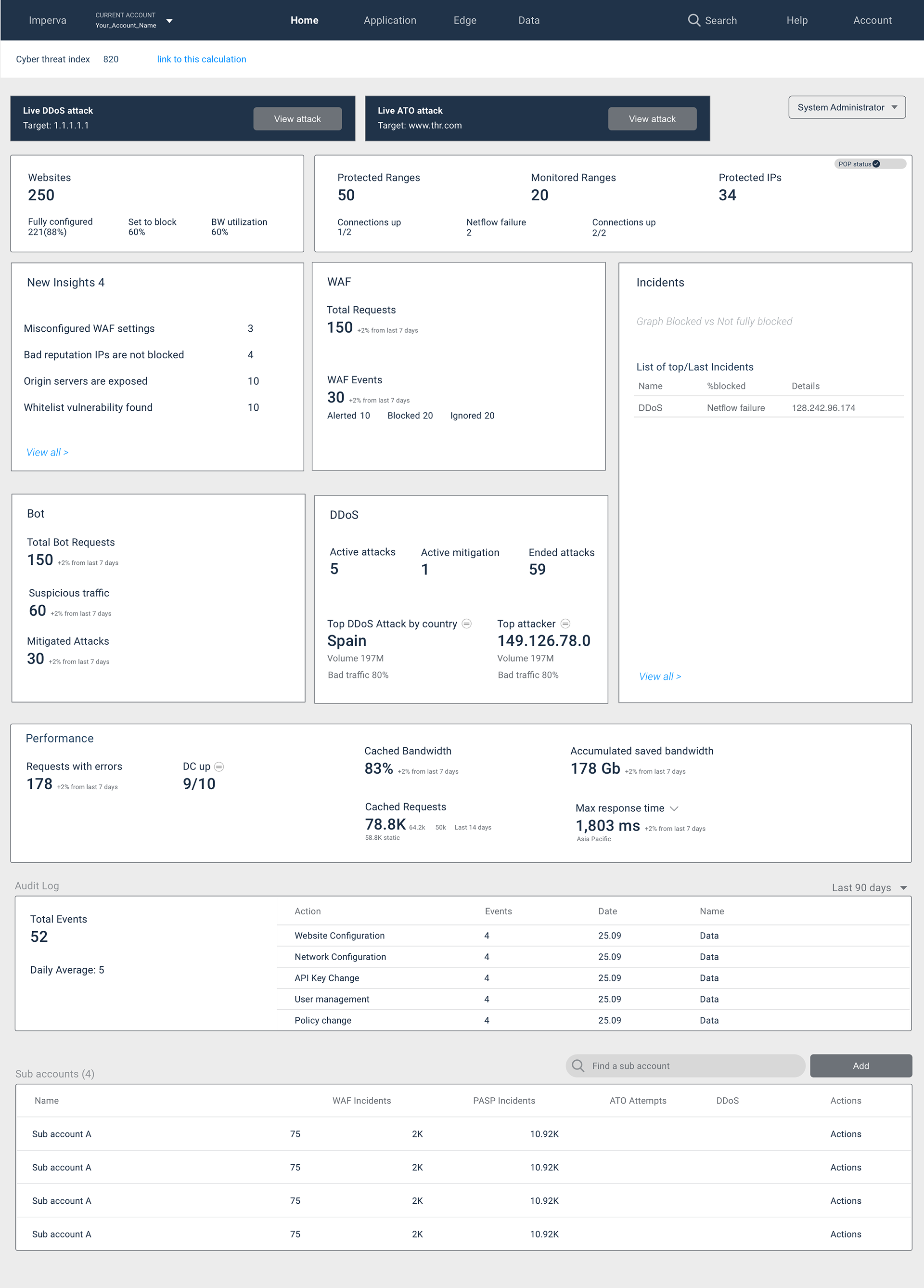
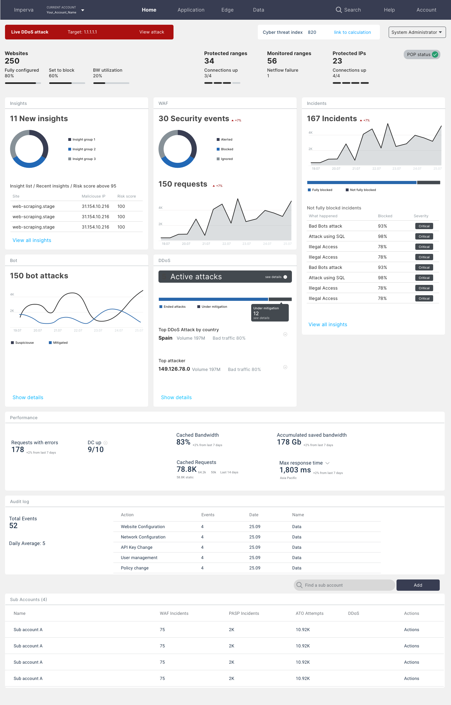
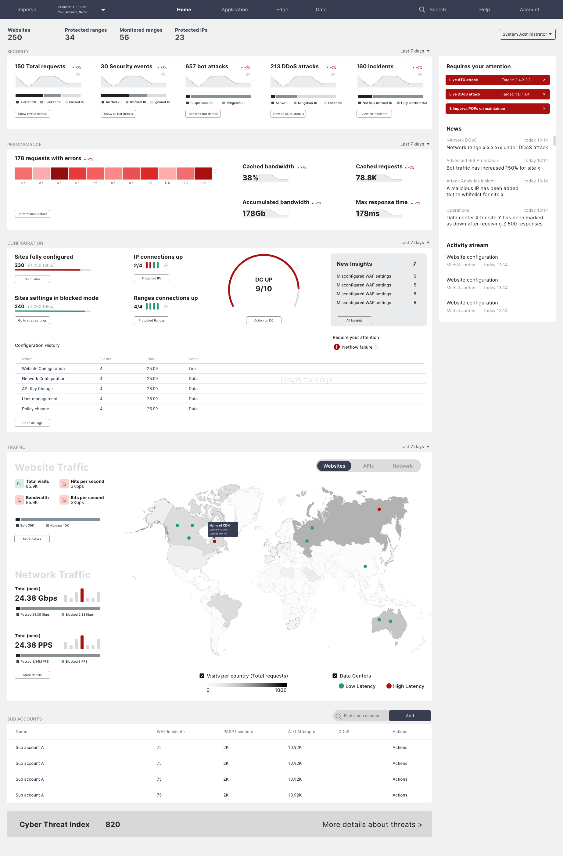
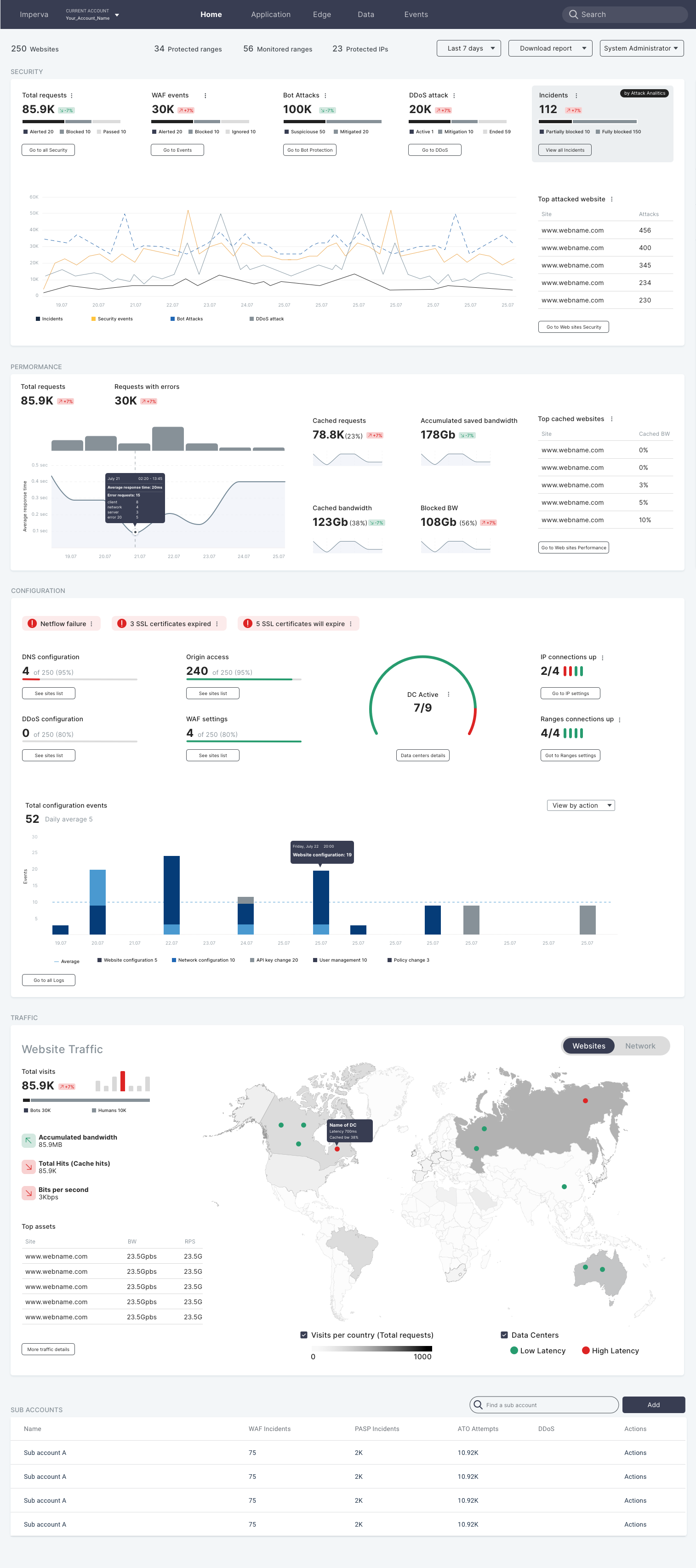
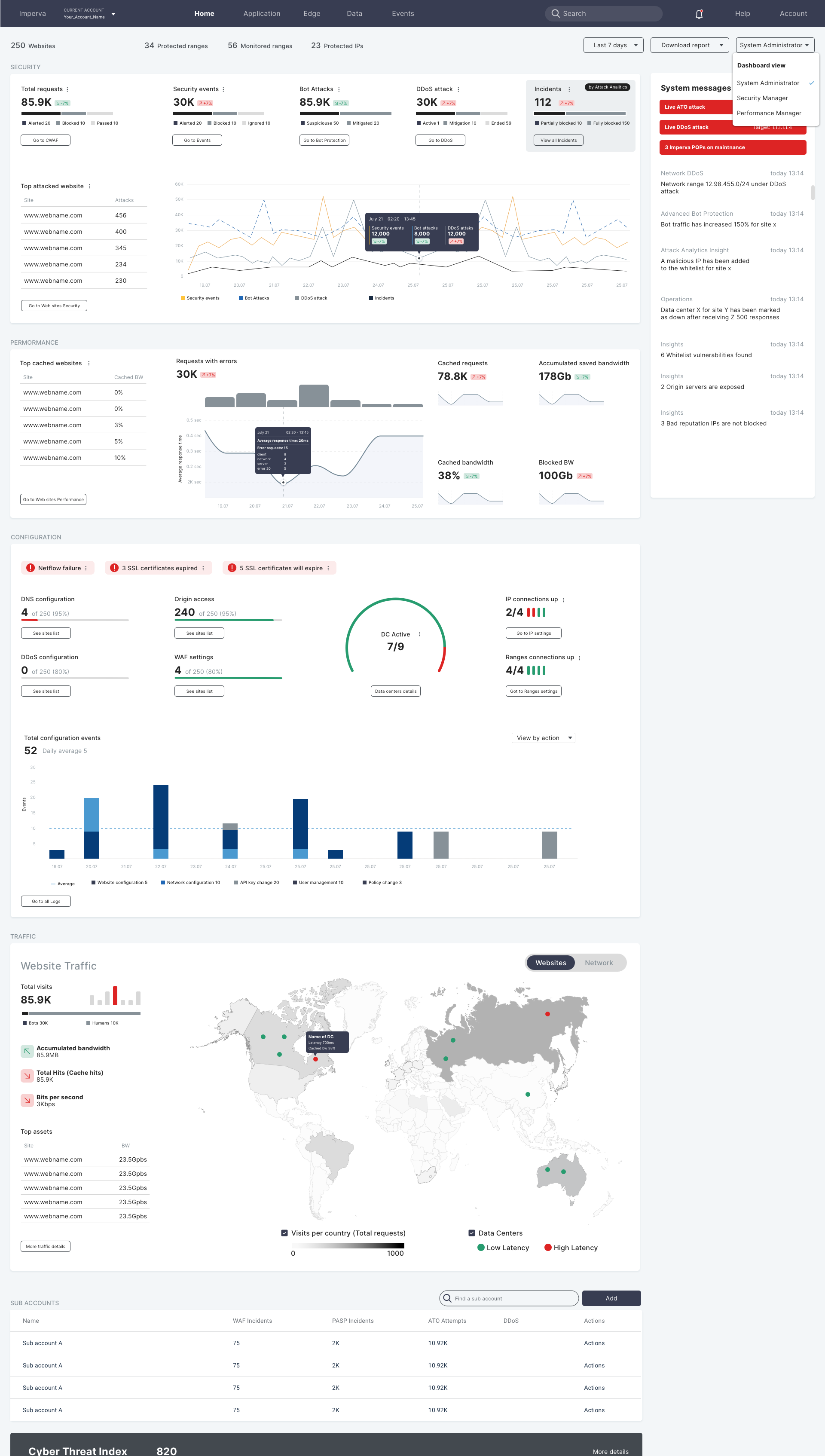
In order to validate our assumptions we created wireframes and questionnaires. We've met with design partners and internal support teams and gathered their feedback for a deeper analysis.
FEEDBACK
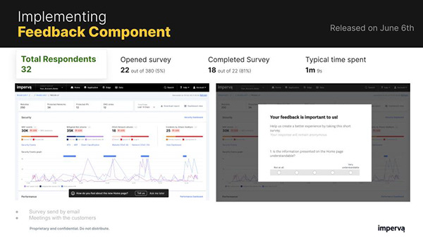
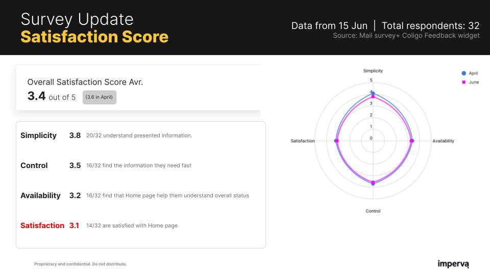
We found that grouping metrics by topic was more intuitive and acceptable than products or assets. We also found certain topics are more critical than others. This helped us to structure the defaults layout according to the common customer.
Outcome
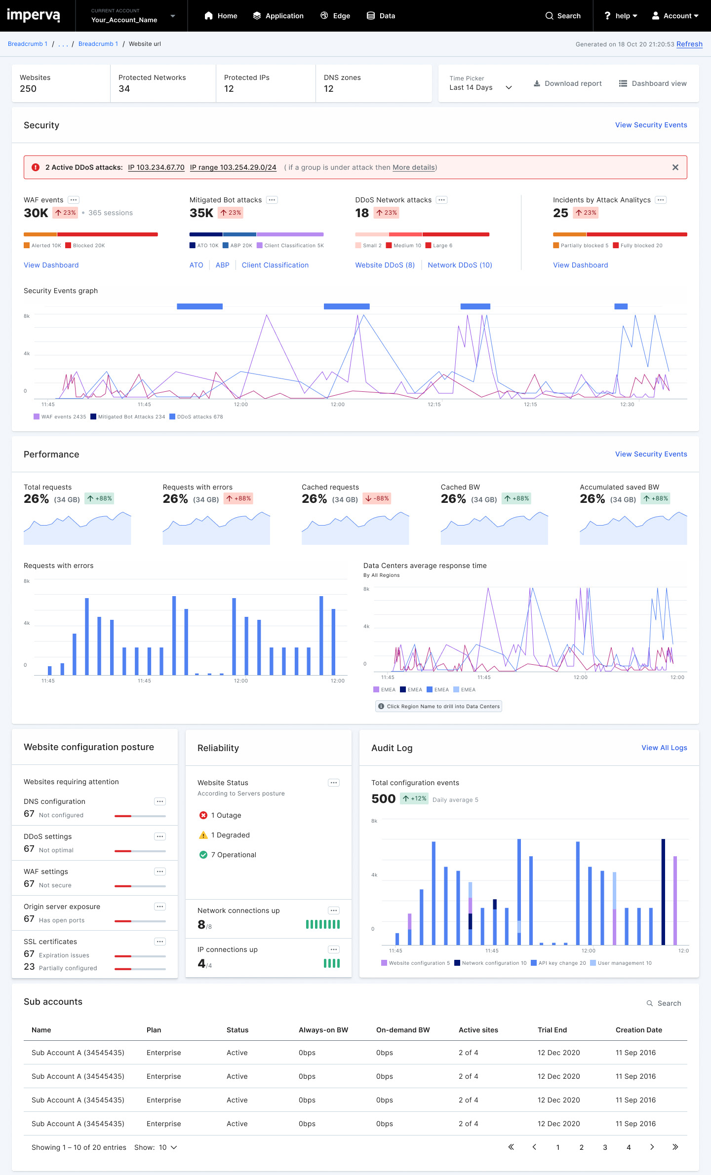
WALKTHROUGH Video
We prepared a demo video to communicate & promote the feature internally, and later with our design partners.
Business Outcomes
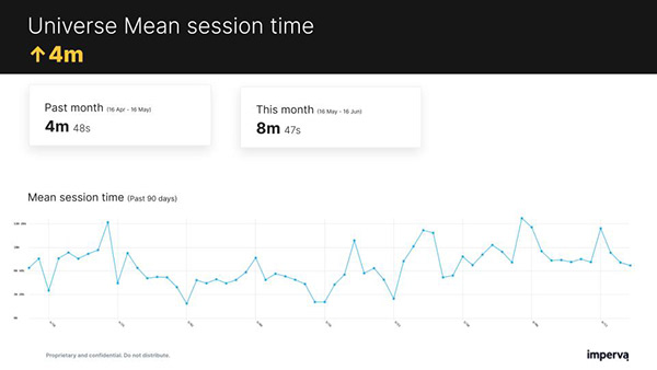
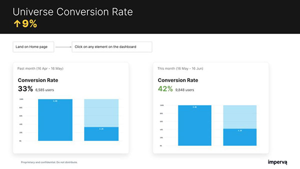
Reduced churn by 5% - due to higher perceived product value and high engagement
Increased competitive advantage - easier to demonstrate the products’ value during sales processes
Improved Imperva's analyst positioning - as a data-driven company
Decreased support costs, and reduce support calls with improved investigation tools
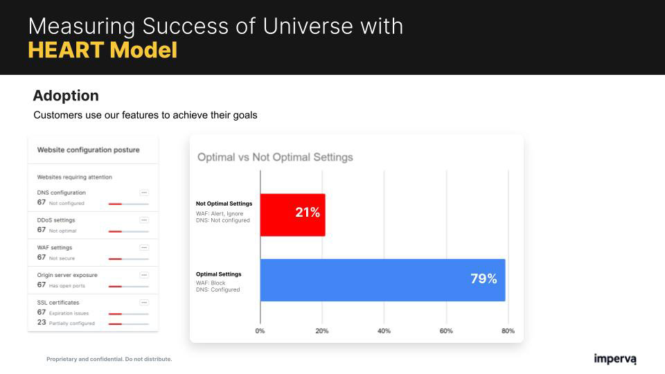
Increased exposure to products and features through exposure on the new dashboard
